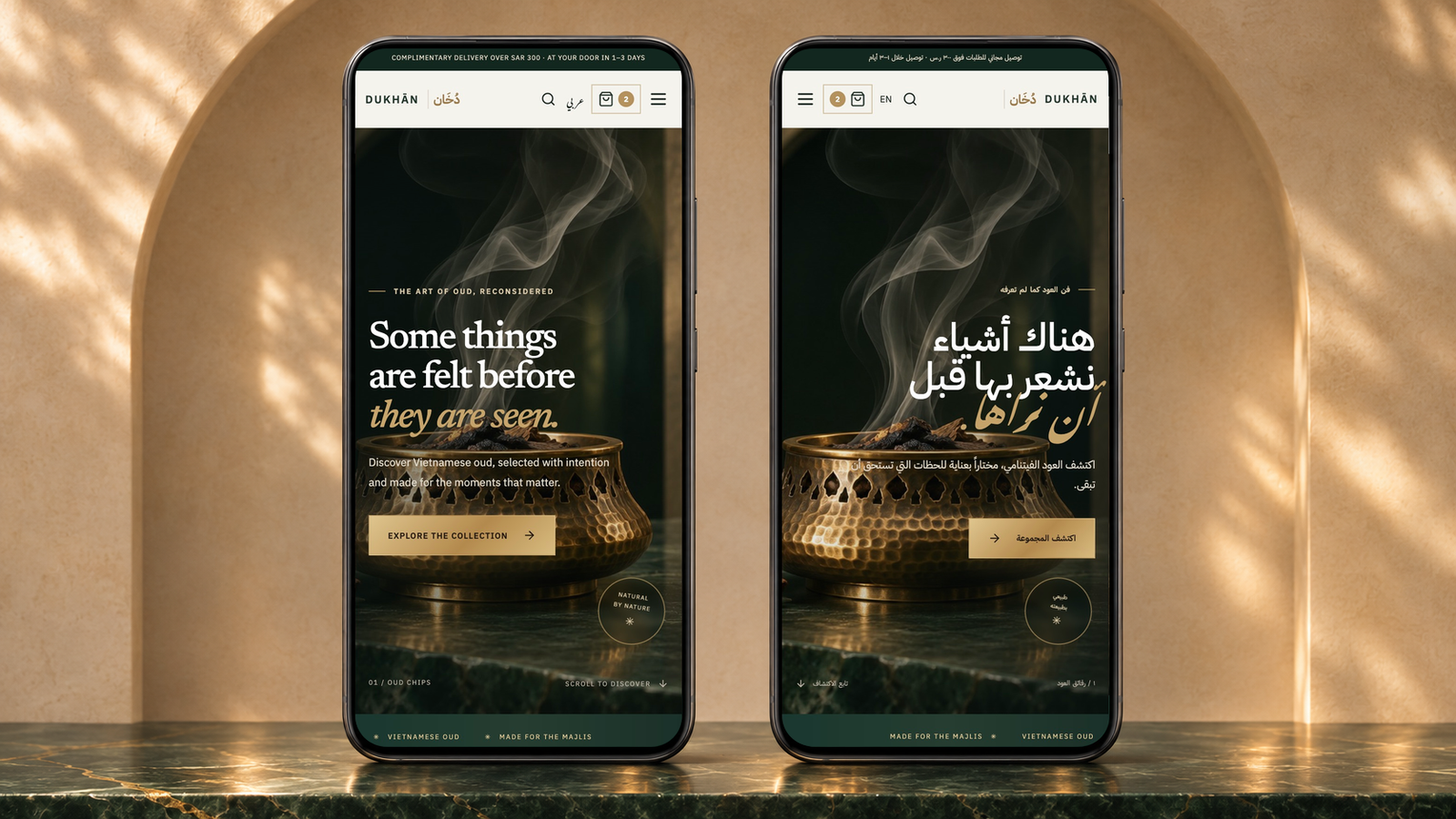
Dukhān brings the sensory world of oud into a clear digital storefront. A distinctive visual identity connects the collection, detailed product stories, ritual guidance, and shopping bag. English and Arabic layouts carry the same sense of care from the opening impression to browsing on a phone.
An atmosphere before a catalogue
Oud is as much about a moment as a material. Dukhān introduces that world through warm brass, rising smoke, deep green, and expressive typography. The opening leads naturally into the collection, while the brand story gives the visitor context before asking them to choose a product.
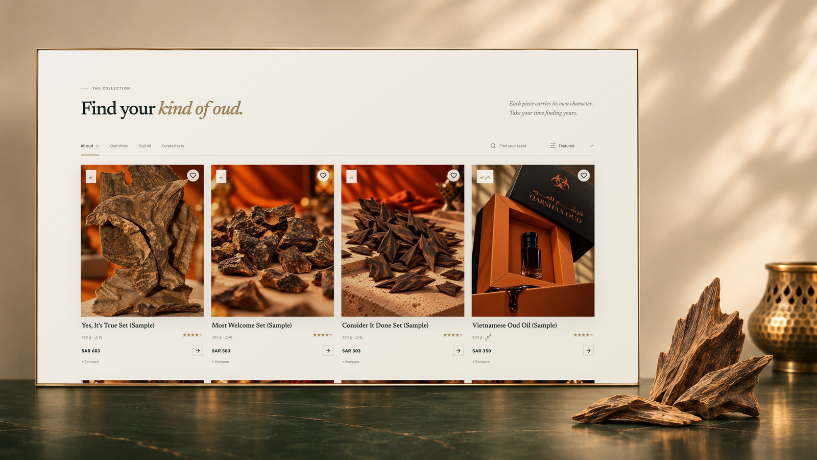
Help people find their kind of oud
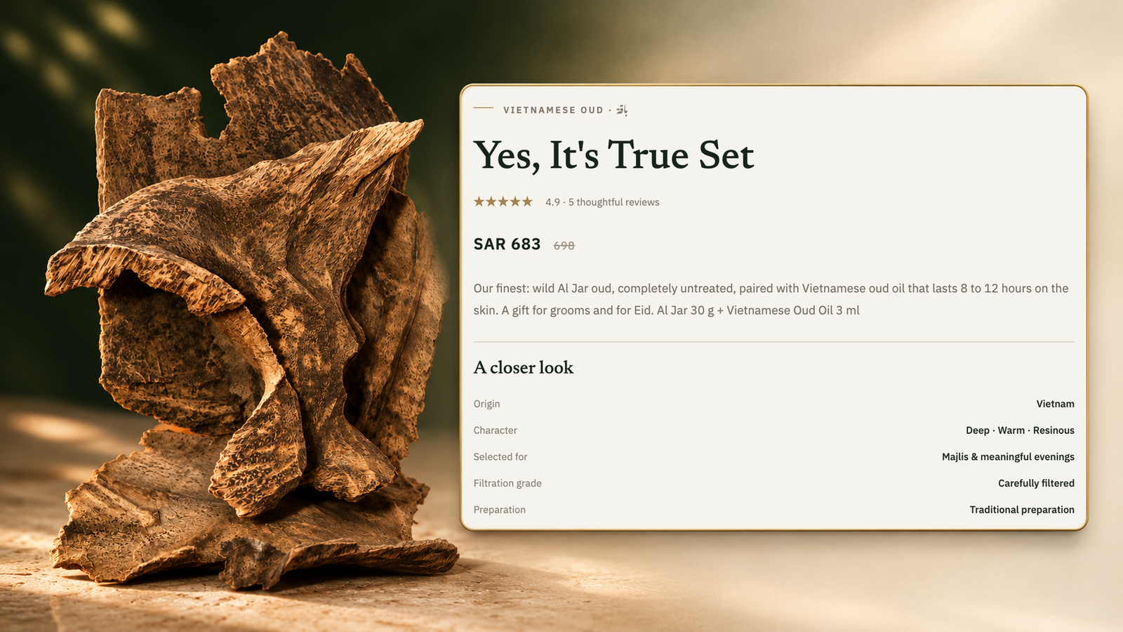
The collection makes room for different starting points: oud chips, oud oil, and curated sets. Category filters, text search, and sorting give browsing a practical structure, while save and compare controls keep interesting pieces close at hand. Product pages then bring photography, price, origin, character, preparation, and intended occasion into a consistent hierarchy.
Discover the collection1 / 2
Find your kind of oud. From curiosity to a focused collection.
Find your kind of oud. From curiosity to a focused collection.
Get to know each piece. Give each piece a character people can understand.
Carry the consideration through the journey
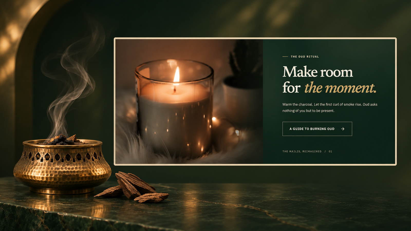
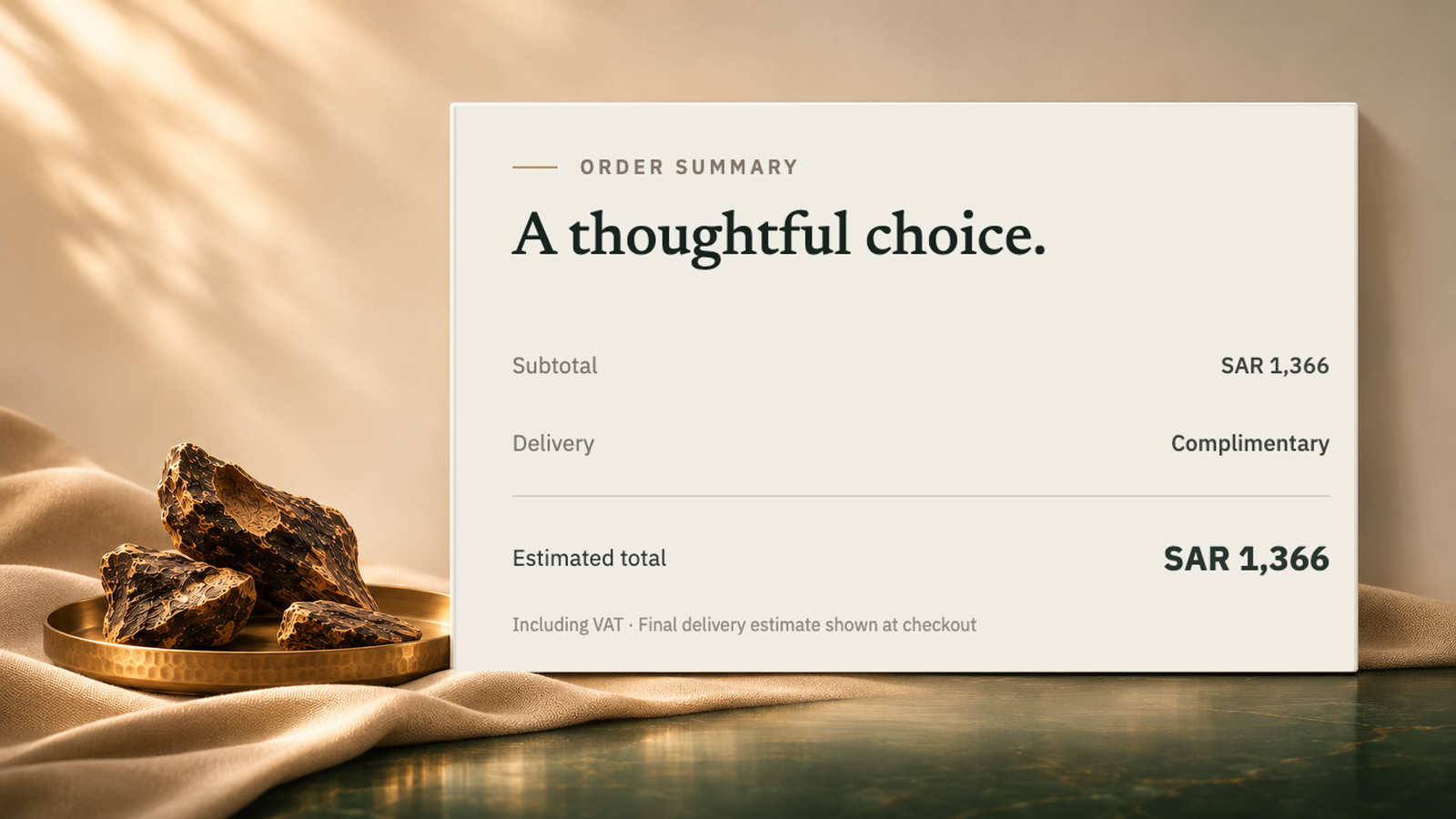
Ritual content and frequently asked questions help visitors understand how oud fits into their own routines. The shopping bag brings the selection, quantity controls, subtotal, delivery, and estimated total together in a clear summary. The same quiet visual language connects discovery, guidance, and the next step.
A considered journey1 / 2
Understand the ritual. Make the product’s ritual part of the experience.
Understand the ritual. Make the product’s ritual part of the experience.
Review your selection. Keep the cost of a selection easy to read.
A familiar experience in either language
Dukhān carries its identity across English and Arabic, with navigation and content adapting to the reading direction. On smaller screens, the collection and product information reflow around a focused mobile layout. The result is a consistent visual experience that gives each language its own space.